In business and analysis, it’s easy to feel overwhelmed by data.
There are too many problems.
Too many metrics.
Too many possible causes.
This is where the Pareto chart quietly earns its reputation.
Based on the well-known 80/20 principle, a Pareto chart helps identify which factors matter most — and which ones deserve immediate attention. But is it always the right tool? And when does it actually add value?
This article explores what a Pareto chart is, when it’s useful, when it’s not, and how decision-makers use it wisely.
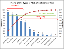
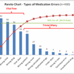
What Is a Pareto Chart?
A Pareto chart is a type of bar chart that:
- Displays categories in descending order of importance
- Combines bars with a cumulative line
- Highlights the “vital few” over the “trivial many”
It is commonly used to identify the most significant causes of a problem.
The concept is simple: a small number of factors often contribute to a large portion of the outcome.
The Idea Behind the 80/20 Principle
The Pareto principle suggests that:
- Roughly 80% of effects come from 20% of causes
This ratio is not exact or universal, but the pattern appears frequently across business, quality control, and performance analysis.
The chart helps visualize this imbalance clearly.
When a Pareto Chart Is Useful
A Pareto chart works best when:
- You need to prioritize issues
- Causes can be grouped into categories
- Data is discrete and countable
- Resources are limited
It answers one key question:
“What should we focus on first?”
Common Business Applications
Pareto charts are widely used in:
- Quality management
- Customer complaint analysis
- Process improvement
- Cost reduction
- Operational efficiency
For example, a company may discover that a small number of product defects cause the majority of returns.
Why Decision-Makers Like Pareto Charts
Executives appreciate clarity.
A Pareto chart:
- Simplifies complex data
- Supports focused decision-making
- Encourages efficient resource allocation
It avoids spreading effort too thin across low-impact issues.
When a Pareto Chart May Not Be Appropriate
Despite its strengths, the Pareto chart is not universal.
It may not be ideal when:
- Data is continuous rather than categorical
- Causes are deeply interconnected
- Priorities change rapidly
- Context matters more than frequency
In such cases, other tools may provide better insight.
The Risk of Oversimplification
One common mistake is assuming the largest bar always deserves immediate action.
Frequency does not always equal impact.
Some low-frequency issues may carry:
- Higher financial risk
- Regulatory consequences
- Reputational damage
Judgment must complement visualization.

How to Use a Pareto Chart Effectively
To use a Pareto chart wisely:
- Ensure data accuracy
- Define categories carefully
- Review assumptions
- Combine with root-cause analysis
The chart highlights where to look, not what to fix.
Pareto Charts and Continuous Improvement
In continuous improvement initiatives, Pareto charts act as starting points.
They:
- Reveal patterns
- Guide investigations
- Track improvement over time
They are tools for focus, not final answers.
The CEO Perspective: Focus Beats Noise
Leaders operate under limited time and resources.
From a strategic standpoint, Pareto charts help:
- Cut through noise
- Direct attention
- Support decisive action
They align well with outcome-driven leadership.
What a Pareto Chart Does Not Do
It does not:
- Explain causation
- Replace analysis
- Guarantee solutions
It supports thinking — it does not replace it.
Final Thoughts: A Tool Worth Using — With Care
So, should you use a Pareto chart?
Yes — when prioritization is needed.
Yes — when data is clear and categorical.
Yes — when focus matters more than detail.
But like any tool, its value depends on how thoughtfully it is applied.
Used correctly, a Pareto chart doesn’t just show data — it helps decision-makers act with intention.
And in business, focused action often matters more than perfect analysis.
End of article.
Summary:
What? you don’t know what it is
Keywords:
trading, stock market, forex,currency, fibonacci
Article Body:
What? you don’t know what it is
Unless you are familiar with manufacturing management principles, you probably have not heard of a pareto chart. It is a very effective tool managers use, to manage and effect outcomes in manufacturing environments. You’re saying, How in the heck will this help my trading? Well it can, if you use it right.
Another name for using pareto charts is, managing by exception. It brings focus on the problem areas, you then try to change these areas to produce different results in the future. With this chart you will quickly see the weakest areas in your trading. On the other hand you also identify your strongest. This allows you to put maximum effort in areas where you need the most improvement.
To build a pareto chart for trading you should start with 3 columns and 12 rows. Place the words; System, Psychology, and Emotion across the top. (one in each column) Down the side you will track each trade. This chart will be used with your trading log. You should all keep a trading log, you can enter information from prior log entries also.
There are three things that directly affect your trading, they are now listed at the top of your pareto chart. After you have listed trades in the side rows. Put a check in the column that corresponds to the main reason you think that the trade was a success or a failure. Once you have completed your list, take a look at the failed trades. You will probably see a pattern of the same reason again and again.
With this simple chart you have quickly identified your main weakness. With this knowledge you can analyze the problem and form solutions to change that outcome. A valuable tool for this is called a root cause analysis.


Tinggalkan Balasan